You have a clear image in your head, but when you type a prompt into an AI tool, the result doesn’t match what you expected. This usually happens because image generators don’t interpret prompts the way people naturally write them. They respond to structured signals, not casual descriptions.
The best way to write image prompts is to use a clear format that defines the subject, style, lighting, composition, and mood in a logical order. When each part of the image is specified, the model has less room to guess, and the output becomes more consistent and usable.
Research from MIT Sloan shows that results from generative AI depend as much on the user’s prompt as they do on the model itself. In practice, that means better structure leads directly to better outputs.
Most people approach prompting by trying different phrases until something works. That leads to inconsistent results and unnecessary repetition. A structured approach removes that guesswork and makes it easier to understand why a prompt works or fails.
This guide focuses on that structure. You’ll learn how image generators interpret prompts, the formula for image prompting that works across tools, and how to refine an image prompt to control style, lighting, and composition more precisely, especially when visuals need to fit into broader workflows like short-form video. You’ll also see side-by-side prompt examples across product shots, portraits, social content, and marketing visuals to show how small changes in a prompt affect the result. In some cases, you can also reverse the process using an image to prompt approach, where existing visuals are used to generate structured prompts.
By the end, you’ll be able to write prompts that produce results you can actually use, without relying on trial and error.
What is an image prompt
To put it simply:
An image prompt is a structured text instruction that tells an AI what image to generate. It defines the subject, style, lighting, composition, and mood. The more specific and organized the prompt, the more accurate and consistent the result will be.
For a more in-depth answer:
Most people think of a prompt as a simple description, but AI models don’t interpret language the way humans do. They break your input into tokens and match those tokens to patterns learned during training. Each word acts as a signal that influences what appears in the final image.
This is why vague prompts lead to generic results. If you write “a city at night,” the model fills in the gaps with an average version based on its training data. When you specify details like lighting, atmosphere, and composition, you reduce ambiguity and get something closer to what you had in mind.
A more useful way to think about an image prompt is as a creative brief rather than a caption. You are defining what should appear in the image, how it should look, and how it should feel. The clearer the instruction is, the less the model has to guess.
How do AI image generators actually work
In simple terms
AI image generators turn text into images by matching the words in your prompt to patterns they learned during training. Each word acts as a signal, and the model combines those signals to predict what the image should look like. The clearer and more structured the prompt, the more accurate the result.
A more technical look:
AI models don’t understand prompts like a human reading a sentence. They break your input into tokens and assign importance to each one based on patterns seen across millions of images and captions. This is why wording, order, and specificity all affect the output.
Earlier words in a prompt usually carry more weight, which is why the subject should come first. If the subject is unclear or buried, the model may prioritize the wrong elements and produce an image that feels off.
This also explains why vague prompts fail. When key details like lighting, composition, or style are missing, the model fills in those gaps with average assumptions. That’s what leads to generic-looking results.
A more practical way to think about this is that you’re not describing an image, you’re guiding a system that predicts visuals based on signals. The more precise those signals are, the less interpretation the model has to do, and the closer the result gets to what you intended.
How to prompt image generators
The short answer:
The best way to write image prompts is to follow a structured formula: subject, style, lighting, composition, mood, and quality cues. Start with the most important element, use clear descriptors, and keep the prompt focused. This reduces ambiguity and helps the model generate images that match your intent.
Breaking it down:
Most prompting issues come from lack of structure, not lack of creativity. When prompts are written as loose descriptions, the model fills in missing details with average assumptions, which leads to generic results.
A structured prompt removes that guesswork. Each part of the image prompt plays a specific role. The subject defines what should appear, style and medium control how it looks, lighting shapes depth and realism, composition determines framing, and mood influences the overall tone.
Order matters as well. Models tend to give more weight to earlier parts of a prompt, so the subject should always come first, followed by the elements that define how the image should be interpreted.
This approach works across tools like Midjourney, DALL·E, Stable Diffusion, and Adobe Firefly. While each tool responds slightly differently, the underlying principle stays the same: clear, structured prompts produce more consistent results than vague or overly complex ones.
That structure is easier to apply when you break it into clear components. Here’s the formula for image prompting that makes it repeatable.
The formula for image prompting
A reliable way to improve any image prompt is to follow a consistent structure, especially if you want consistent results across different tools and use cases. The most effective formula for image prompting is:
[Subject] + [Style/Medium] + [Lighting] + [Composition] + [Mood/Atmosphere] + [Quality cues]
Each part plays a specific role. When combined, they give the model clear instructions and reduce ambiguity, which leads to more accurate and usable outputs.
Here’s how that difference shows up in practice:
The difference comes from structure. The improved version defines what the subject is, how the image should look, how it should be lit, and how it should feel, instead of leaving those decisions to the model.
Breaking down each element of a good image prompt
Each part of the prompt formula controls a specific aspect of the image. Understanding what each element does makes it easier to adjust your prompts and get consistent results instead of relying on trial and error.
Subject: start with what matters most
Your subject is the “who” or “what” of the image, and it should always come first. Don’t just name it, describe it clearly. Include details like age, expression, posture, clothing, material, or environment.
It also helps to describe what the subject is doing. Action words like running, glowing, or resting produce very different results than static descriptions.
Weak prompt: a dog
Improved prompt: a golden retriever puppy mid-leap, ears flying, mouth open in play
The more concrete the subject is, the less the model has to guess.
Style and medium: define how the image should look
If you don’t specify a style, the model defaults to an average interpretation based on training data. That’s rarely what you want.
Style descriptors can include:
- Medium: oil painting, watercolor, 3D render, illustration, photorealistic
- Genre: cinematic still, editorial fashion, product photography, concept art
- Reference: inspired by Bauhaus design, Studio Ghibli style, dark fantasy
You can combine styles, as long as they don’t conflict. For example, a watercolor illustration with cinematic lighting adds texture while keeping depth.
Lighting: control depth and realism
Lighting is one of the biggest factors separating basic outputs from professional-looking images. It controls mood, contrast, and perceived quality.
Think in simple, practical terms:
- soft window light from the left → calm, natural
- dramatic rim lighting → strong contrast, cinematic look
- golden hour backlight → warm, nostalgic
- neon lighting at night → urban, stylized
- studio lighting → clean, commercial
If lighting isn’t specified, the model fills in a generic default.
Composition: control framing and perspective
Composition determines how elements are arranged in the frame. Without guidance, most outputs default to centered and flat layouts.
Useful composition terms include:
- Shot type: close-up, wide shot, macro
- Framing: rule-of-thirds, subject on one side, negative space
- Angle: low angle, overhead, eye-level
- Depth: shallow depth of field, blurred background, sharp foreground
Clear composition makes the image more usable and visually intentional.
Mood and atmosphere: define the emotional tone
Mood influences color, texture, and expression. It helps move the image from technically correct to visually engaging.
Examples:
- warm and nostalgic
- eerie and mysterious
- clean and minimal
- playful and energetic
You can also describe atmosphere directly, like fog, rain, dust, or glow, to reinforce the mood.
Quality cues: refine the output
Quality cues signal that you want a polished result, but they should be used carefully.
Examples:
- sharp focus
- high resolution
- cinematic depth of field
- professional photography
Using too many quality cues can reduce clarity, so limit them to a few strong signals.
Before-and-after image prompt examples by use case
Here’s where the structure becomes practical. The examples below show how small changes in a prompt lead to more usable results across common content use cases.
Product shots
- Weak: a skincare product
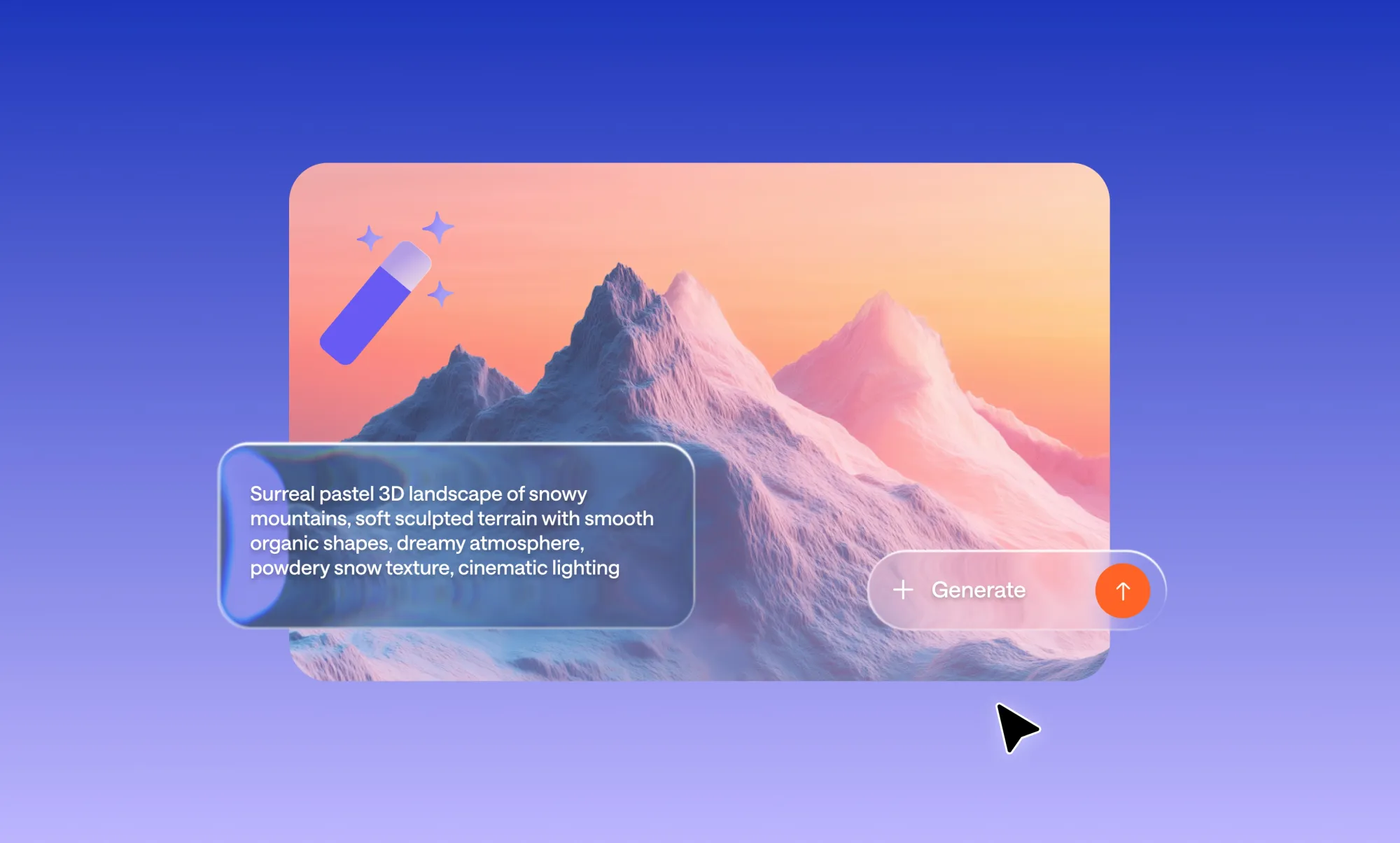
- Improved: minimalist product shot of a white ceramic skincare jar on a grey marble surface, soft diffused studio lighting from above, top-down composition, clean white background, commercial photography style, sharp focus, no watermark
Why it works: Specifying surface, lighting angle, background colour, and shot style gives the AI everything it needs to produce something usable for an e-commerce page.
Portraits
- Weak: a man looking serious
- Improved: close-up portrait of a 35-year-old man with light stubble, direct gaze, dramatic side lighting from the right, shallow depth of field, muted colour palette, photorealistic, cinematic grain, catchlight in eyes
Why it works: Age, expression, lighting direction, and technical specs all reduce ambiguity. The AI isn’t guessing anything important.
Social media content
- Weak: a girl with coffee
- Improved: lifestyle photo of a young woman holding a latte in both hands, cosy café interior, warm afternoon light, candid and natural expression, soft bokeh background, editorial Instagram style, vertical 4:5 crop
Why it works: Crop ratio (4:5) means it’s ready for Instagram without editing. Specifying “candid” and “not stock photo” steers the AI away from stiff poses.
Concept art
- Weak: a futuristic city
- Improved: sweeping wide-angle concept art of a neo-Tokyo megacity at night, layered neon signs, rain-slicked streets reflecting light, moody cyberpunk atmosphere, volumetric fog, cinematic depth, detailed foreground with street vendors
Why it works: Environment details (neon signs, rain, fog) create an image that has genuine depth and storytelling, not just a generic skyline.
Realistic marketing visuals
- Weak: a team working in an office
- Improved: professional lifestyle photo of a diverse team collaborating around a glass table in a modern open-plan office, natural window lighting, warm neutral tones, candid energy, corporate photography style, high resolution, no stock photo feel
Why it works: “No stock photo feel” is a powerful negative cue that tells the AI to avoid the stiff, staged aesthetic that plagues generic business imagery.
How to prompt image generators for style, lighting, composition, and text accuracy
Getting a decent first result is only half the process. Real control comes from refining your image prompt by adjusting specific elements instead of rewriting everything. When you change one variable at a time, it becomes much easier to understand what’s improving the result and what isn’t.
Iterate one variable at a time
When a result isn’t quite right, avoid rewriting the entire prompt. Identify the specific element that’s off. This includes adjusting things like lighting, composition, or camera angle when the perspective doesn’t feel right.
This approach helps you build a clearer understanding of how each modifier affects the output, instead of relying on trial and error.
Use negative prompts to subtract junk
Negative prompts tell the model what to exclude. They’re especially useful for cleaning up common AI artefacts.
Common negative prompts:
- blurry, low quality, distorted
- watermark, text, logo
- extra fingers, deformed hands
- oversaturated, cluttered background, plastic skin
For business visuals:
- casual clothing
- poor lighting
- stock photo aesthetic
- cheap looking, unfocused
Getting text right inside images
Text rendering is one of the hardest things for AI image generators. Models learn from pixel patterns, not language rules, so letters often come out garbled or nonsensical.
Tips for readable text in generated images:
- Try to keep the text under 25 characters
- Enclose the exact text in double quotation marks within your prompt
- Describe font style, not font name: clean bold sans-serif rather than Helvetica
- Ideogram is currently the strongest model for text-in-image use cases
Match your prompt style to the tool
The best way to write image prompts isn’t identical across platforms. Here’s a quick reference:
When you’re working inside a tool like Async, you can apply these refinements directly while generating images in your project. Instead of rewriting prompts blindly, you can see how each adjustment affects the result and refine it in context, which makes the process faster and more predictable.
Common image prompting mistakes (and how to fix them)
Most image prompt issues come from a few common mistakes: being too vague, adding too much at once, skipping key elements like lighting and composition, or ignoring how different tools behave. Fixing these usually improves results faster than rewriting prompts from scratch.
Even experienced creators run into the same problems. Here’s the shortlist:
Being too vague:
“A sunset” gives the model almost nothing to work with.
“A dramatic sunset over a Norwegian fjord, long-exposure photography, warm orange and purple tones, mirror reflection in still water, cinematic wide shot” gives it clear direction.
Overloading the prompt:
A long list of modifiers can confuse the model and produce inconsistent results. Stick to the core structure and refine from there.
Skipping composition and lighting:
These two elements have a bigger impact than most quality cues. Adding even one lighting condition and one composition detail can significantly improve the result.
Not saving what works:
When a prompt produces a strong result, save it. Building a small prompt library by use case saves time and improves consistency.
Ignoring the tool’s strengths:
Different models handle prompts differently. Trying to force the same structure everywhere can lead to weaker results. Adjust your prompt style to match the tool.
Image prompt templates for marketing and content creators
Using ready-made prompt templates helps you generate consistent results faster. Instead of starting from scratch, you can follow a structured format tailored to specific use cases like thumbnails, social media posts, or landing pages, then adjust details based on your needs.
These templates are designed to be reused and adapted depending on your content.
YouTube thumbnail template
Template:
YouTube thumbnail, [main subject], [optional secondary element], bold color contrast, strong focal point, cinematic lighting, high contrast, expressive composition, ultra sharp
Example (split-screen style):
YouTube thumbnail, shocked man on the left, glowing laptop on the right, bold red and yellow contrast, cinematic lighting, high contrast, expressive composition, ultra sharp
Why this works:
The contrast and clear focal points make the image easy to read and attention-grabbing at small sizes.
Instagram reel cover template (9:16)
Template:
Vertical lifestyle shot of [subject], [environment], soft natural lighting, clean color palette, [mood], editorial style, 9:16 format
Example:
vertical lifestyle shot of a minimalist home office, soft morning light through curtains, clean neutral tones, aesthetic and aspirational mood, editorial style, 9:16 format
Why this works:
The lighting and mood create a clean, scroll-friendly visual that fits naturally into social feeds.
Landing page hero template (16:9)
Template:
Wide hero image of [subject or scene], [environment], natural lighting, [energy or tone], professional photography style, clean composition, no stock photo aesthetic
Example:
Wide hero image of a creative team brainstorming in a modern studio, natural daylight, warm energy, professional lifestyle photography, clean composition, no stock photo aesthetic
Why this works:
The scene feels natural and usable for branding while avoiding a staged or generic look.
Podcast cover template
Template:
square cover image, [subject], [environment], strong color palette, bold composition, space reserved for title text
Example:
square podcast cover, illustrated portrait of a woman with microphone in a neon-lit studio, retro color palette, bold composition, space at the top for title text
Why this works:
The strong composition leaves room for text while keeping the image visually engaging.
Product shot template (e-commerce)
Template:
minimalist product shot of [product], placed on [surface], [lighting setup], clean background, commercial photography style, sharp focus
Example:
minimalist product shot of a skincare bottle on a marble surface, soft diffused lighting from above, clean background, commercial photography style, sharp focus
Why this works:
The lighting and setup keep the focus on the product while making it look polished and usable.
Generating images inside Async
Writing a strong image prompt is one part of the process. Being able to test and refine that prompt in context is what makes it useful.
Async lets you generate images directly inside the editor while working on your content, so you can adjust prompts based on how the visual actually performs, not just how it looks on its own.
SCREENSHOT
Step 1: Choose the right image tool
Async gives you two ways to create images, depending on your goal:
- AI Thumbnails → best for thumbnails and social covers
- Image generation inside the editor → best for scenes, backgrounds, and general visuals
Step 2: Generate your image
Write your prompt using the same structure you’ve learned: subject, style, lighting, composition, and mood.
Generate a few variations and pick the one that’s closest to your intent.
Step 3: Evaluate the result in context
Place the image into your project as a thumbnail, scene, or visual that can later be turned into AI clips. Instead of judging it in isolation, look at how it fits within your content.
Step 4: Refine your prompt
Adjust one element at a time based on what’s missing:
- lighting feels flat → refine lighting
- framing is off → adjust composition
- tone doesn’t match → update mood
This makes iteration faster and more predictable.
How to apply this going forward
The best way to write image prompts is not about finding the right words by chance. It’s about using a clear structure that defines what the image should show, how it should look, and how it should feel. This approach is what makes the best way to write image prompts repeatable instead of unpredictable.
Once you understand the formula, prompting becomes predictable. You’re no longer guessing what to type or relying on repeated trial and error. You’re making small, intentional adjustments based on what the result is missing.
Most improvements don’t come from making prompts longer. They come from being more specific about the right things, especially subject, lighting, and composition.
At that point, prompting becomes a practical tool. You can generate visuals faster, reuse what works, and build consistency across your content without starting from scratch each time.
When you’re ready to take those visuals further, Async lets you generate images directly inside your project, combine them with AI voices, and publish across social content without switching tools.
Frequently asked questions
What is the best way to write image prompts for beginners?
The best way to write image prompts as a beginner is to follow a simple structure: subject, style, lighting, composition, and mood. Start with a clear subject, add one or two descriptors, and avoid overloading the prompt. Most improvements come from adding lighting and composition, not making the prompt longer.
How long should an image prompt be?
Most effective image prompts are between 20 and 60 words. Clarity matters more than length. A short, structured prompt with specific details will perform better than a long, unfocused one. If a prompt feels unclear, simplify the idea first, then build it back with key elements.
Why do my AI-generated images look generic?
Images usually look generic when the prompt is too vague. If you only describe the subject without defining style, lighting, or composition, the model fills in the gaps with average patterns. Adding even a few specific details can significantly improve the result.
What is the formula for image prompting?
A reliable formula for image prompting is: subject, style or medium, lighting, composition, mood, and quality cues. This structure works across most tools and helps reduce ambiguity by clearly defining how the image should look and feel.
What is image-to-prompt and when should I use it?
Image-to-prompt means taking an existing image and generating a prompt that could recreate it. It’s useful when you want to match a specific style or learn how to describe complex visuals. You can then reuse and adapt that structure for your own prompts.
Do different AI image tools require different prompts?
Yes, different tools respond to prompts in slightly different ways. Some work better with short phrases, while others handle full sentences or structured keywords. The core structure stays the same, but adjusting your prompt style to the tool can improve results.
PakarPBN
A Private Blog Network (PBN) is a collection of websites that are controlled by a single individual or organization and used primarily to build backlinks to a “money site” in order to influence its ranking in search engines such as Google. The core idea behind a PBN is based on the importance of backlinks in Google’s ranking algorithm. Since Google views backlinks as signals of authority and trust, some website owners attempt to artificially create these signals through a controlled network of sites.
In a typical PBN setup, the owner acquires expired or aged domains that already have existing authority, backlinks, and history. These domains are rebuilt with new content and hosted separately, often using different IP addresses, hosting providers, themes, and ownership details to make them appear unrelated. Within the content published on these sites, links are strategically placed that point to the main website the owner wants to rank higher. By doing this, the owner attempts to pass link equity (also known as “link juice”) from the PBN sites to the target website.
The purpose of a PBN is to give the impression that the target website is naturally earning links from multiple independent sources. If done effectively, this can temporarily improve keyword rankings, increase organic visibility, and drive more traffic from search results.